
Tile Samples: Compare Colors at Home Like a Pro in 2026
Learn how to compare tile samples at home with lighting, grout, spill, and comfort tests. Brampton-focused, step-by-step guide for confident tile decisions.
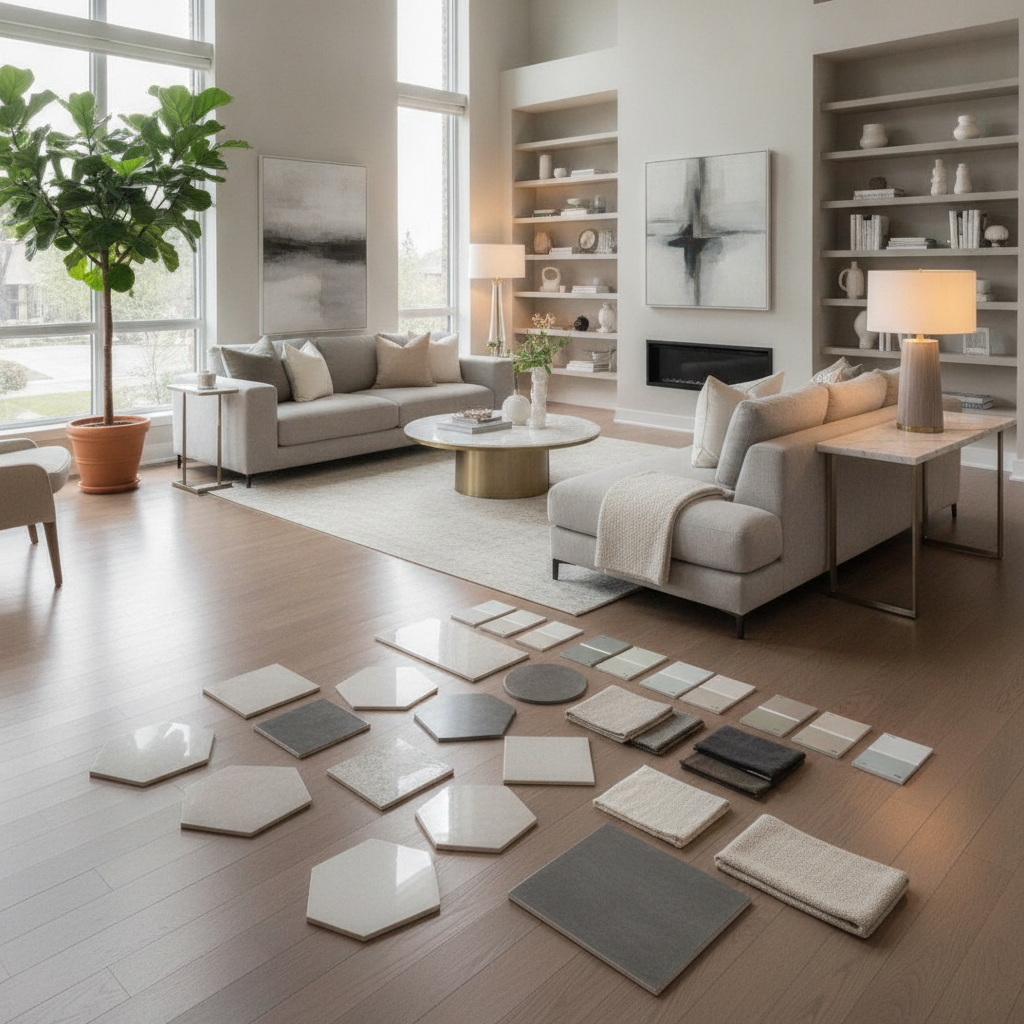
Comparing tile samples at home is the process of testing color, finish, size, grout, and texture in your real lighting and daily routines. In Brampton, bring loaner samples from Metro Tiles & Flooring, place them where they’ll live, and evaluate across morning, afternoon, and evening light while running quick spill, slip, and cleanability tests.
By Metro Tiles & Flooring • Last updated: 2026-06-25
Introduction
Testing tile samples at home reduces regret by revealing true color and texture under your lighting and habits. Showroom lighting can mask undertones and sheen. At home, you’ll spot grout-dependent shifts, slip feel when wet, and how patterns scale in your room before committing to full boxes.
Here’s the simple truth: how to compare tile samples at home is about setting up fair tests that mimic daily life. Store displays are helpful, but your own lighting, wall colors, and cleaning routine decide whether a tile looks crisp or dingy, secure or slick, modern or busy.
Metro Tiles & Flooring serves Brampton homeowners, condo owners, and property managers with take-home samples, expert guidance, and professional installation. We carry premium porcelain and ceramic brands such as Baldocer, Gayafores, and La Platera, plus matching trims, mosaics, and accessories, so you can build a complete, coordinated look from floor to backsplash.
In this guide, you’ll learn the exact process we coach in our showroom: what to bring home, the tests that matter, and a 48-hour routine that delivers a confident decision. We’ll also point to related resources, like our porcelain vs. ceramic comparison and installation planning checklist, so you’re prepared from selection to delivery.
Quick Summary
Lay out 3–5 finalists, test them under different lights, mock up grout, and run quick spill, slip, and scratch checks. Photograph each setup, live with it for 48 hours, then pick the surface that looks right in most conditions and feels best underfoot. Confirm stock and schedule installation.
- Who this helps: Brampton homeowners, condo boards, and small businesses choosing bathroom tiles, kitchen backsplash tiles, or floor porcelain tiles.
- What you’ll do: Compare color, undertone, sheen, texture, and pattern scale; preview grout lines; simulate real-life messes and cleaning.
- Tools: Painter’s tape, temporary spacers, grout sticks, microfiber cloth, water and coffee, flashlight/phone light, camera, and a ruler.
- Timeline: Plan 48 hours to view morning, midday, and evening light; aim for consistent photos from the same spot.
- Tests at a glance: Lighting check, fabric/paint pairing, grout mockup, spill and wipe, wet-grip feel, scratch on a cut edge, and cleanup time.
- Decision rule: Choose the tile that wins in at least two of three lighting conditions and passes the spill/clean test without staining or heavy streaking.
- When to ask for help: If a condo needs sound attenuation or large-format leveling, book installation and underlayment guidance early.
Local considerations for Brampton
- Daylight swings are strong in winter; check samples under warm evening light and cool daylight so bathroom tiles don’t read green or pink at night.
- If you commute via Intermodal - Zum Bovaird Station Stop NB, coordinate sample pick-ups/returns around your schedule—our team can prep labeled boxes.
- High-traffic entries near Airport Rd n/of Clark Blvd track salt in winter; prioritize textured porcelain with confident wet grip and quick cleaning.
Before You Start (Prerequisites)
Collect the right samples, tools, and context. Request full-size pieces when available, matching trim/bullnose, and physical grout swatches. Bring home 3–5 serious contenders and the main paint/fabric you’ll live with. Plan a clear, safe test zone and take photos in consistent positions for fair comparisons.
The best home comparison starts with the right kit. Small chips are fine for color, but large pieces (12×24, 24×24, or 24×48) reveal scale, veining, and how grout breaks up the surface. Include the finishes you’re considering—matte, satin, polished, or structured—for a true side-by-side.
What to request from the showroom
- Full-size or cut sheets of each candidate (bigger formats make undertones and texture obvious).
- Matching trims/bullnose and any stair-nose or thresholds you may need at transitions.
- Grout swatches in light, mid, and dark; ask for both sanded and unsanded where relevant.
- Brand context: Baldocer, Gayafores, and La Platera lines often include coordinated mosaics and decors for niches and features.
- Finish options: matte for low glare, polished for reflectivity, structured textures for wet zones.
If you’re weighing surface types, this refresher helps: our porcelain vs. ceramic tiles guide explains water absorption, durability, and where each shines in real homes.
Tools and simple supplies
- Painter’s tape, 1/16–1/8 inch spacers, and a straightedge or ruler.
- White and charcoal grout sticks or a small tub of premixed mockup paste.
- Water spray bottle, black coffee or tea for stain simulation, and a drop of dish soap.
- Microfiber cloths and paper towels for wipe tests.
- Phone/camera and access to both warm (about 2700–3000K) and daylight (around 5000K) bulbs.
Safety and care
- Lift with two hands; large-format tiles can be heavy and edges are sharp.
- Use felt pads under samples on hardwood, vinyl, or furniture to avoid scratches.
- Keep liquids away from cords and place towels under spill tests.
Preparation saves time later. When you return to the showroom with notes and photos, we can translate what you learned into trims, layout choices, and an installation plan that avoids surprises.
How to Compare Tile Samples at Home: Step-by-Step
Set a test zone, lay out 3–5 finalists, and evaluate in three passes: lighting and color, function and mess, and scale and pattern. Use consistent photos and quick notes. After 48 hours of real-life use, shortlist two, confirm stock, and book installation.
This is the method we use when clients ask how to compare tile samples at home without second-guessing. It breaks the decision into measurable checks you can repeat in any room. Each pass takes minutes, and the results are easy to share with family or your installer.
1) Create a fair test zone
- Clear a 3×5 ft area where the tile will live; sweep and set felt pads to protect existing floors.
- Place tiles with consistent 1/8 inch gaps using temporary spacers. Align with walls to preview grout lines.
- Photograph from standing and seated height to mimic real viewing angles.
Fairness matters. Your brain notices inconsistencies; same spacing and angles prevent a biased pick and make photo comparisons clear.
2) Check lighting and undertones
- View at sunrise, midday, and evening. Warm bulbs (about 2700–3000K) bring out beige/yellow; 5000K daylight emphasizes blue/gray.
- Hold a pure-white sheet beside each tile to reveal hidden green, pink, or purple undertones.
- Note if polished surfaces glare under downlights; matte often hides streaks and prints.
Lighting shifts are real. Most showrooms run neutral 3500–4000K; your kitchen might be warmer or cooler. That single variable can make a gray tile lean blue in the morning and beige at night. Photos at both temperatures make the pattern obvious.
3) Pair with paint, cabinets, and fabrics
- Set cabinet doors, countertop chips, and paint cards right on the tile. Move them a few inches to see how grout breaks up the field.
- For marble-look tiles, ensure veining complements—not competes with—your stone or quartz.
- Label photos “warm light” and “daylight” for easy review later.
Design lives in combinations. A tile that looks perfect alone may clash with a countertop pattern. Small shifts in undertone can echo nearby finishes—for better or worse.
4) Mock up grout choices
- Run thin beads of light, mid, and dark grout mockups between tiles. Light grout enlarges rooms; dark grout outlines each tile.
- On rectified tiles, 1/16–1/8 inch joints feel seamless; pressed edges usually look best around 3/16.
- Decide whether you want seams to disappear (near-match) or read as a graphic grid (contrast).
Grout is a multiplier. It can modernize a simple tile or make a bold pattern feel busy. Never skip the mockup—grout color often changes the look more than the tile itself.
5) Spill, wipe, and cleanability test
- Spray water on matte vs. polished; watch beading, darkening, and any streaking after it dries.
- Place a coffee ring for 10 minutes, then wipe with a drop of dish soap. Texture may trap residue; porcelain and glazed ceramic typically release stains readily.
- Time cleanup. The surface that cleans faster with fewer streaks often wins in daily life.
Cleaning reality check: life brings splashes, toothpaste, and cooking oils. A 60-second wipe test reveals more than an hour of online browsing ever will.
6) Wet grip and barefoot comfort
- With care, wet your fingertips and gently rub the surface; structured finishes usually feel more secure.
- Walk barefoot across samples; polished floors can feel cool and slick, while matte or textured add confidence.
- For showers, favor tiles marketed for wet floors with higher grip textures.
Comfort builds trust. If a tile feels tense underfoot when damp, that feeling won’t disappear after installation. Trust what your feet tell you during testing.
7) Scratch and abrasion preview
- Lightly drag a copper coin across a cut edge or the back—not the display face—to gauge resistance.
- Place a chair leg with a felt pad and twist gently; check for visible marring.
- Textured and matte finishes often disguise micro-wear better than high-polish.
Durability is context. Pets, kids, and grit at entries accelerate wear. Choosing a finish that hides micro-marks is a smart long-term decision.
8) Pattern scale and layout
- On 24×48 or long-plank looks, keep offset at 33% or less to reduce lippage risk and optical bowing.
- Use painter’s tape to outline a shower niche or backsplash height to test mosaics and decors.
- Shuffle pieces to avoid pattern repeats clumping—stone-looks often cycle every few faces.
Layout previews prevent surprises. Taping thresholds and first/last tile positions guards against sliver cuts and awkward seams at doorways.
9) Live with it for 48 hours
- Leave samples out through two dish cycles or showers. Track footprints and cleanup time.
- If a tile “wins” only at night or only in daylight, treat that as a tiebreaker—not the final word.
- Ask family to rate comfort and appearance in one sentence each. Short feedback beats debates.
Decisions settle with time. A tile that looks great for five minutes may reveal quirks after a day of normal use. Forty-eight hours smooths knee-jerk reactions.
10) Decide, then confirm logistics
- Pick the tile that looks right in most conditions and meets slip/cleanability needs.
- Confirm trims, mosaics, and any stair-nose or threshold parts for clean transitions.
- For condos, verify soundproof underlayment and building rules before scheduling installation.
Ready to go? Review your findings with us, and we’ll translate them into a layout plan and delivery date. For a helpful checklist before you lock in dates, see 5 questions to answer before new flooring and how to plan your flooring installation timeline.
Home sample test matrix
| Factor | What to test | Good signs | Watch-outs |
|---|---|---|---|
| Lighting | 2700K vs 5000K | Color stays consistent | Undertone flips green/pink |
| Grout | Light/mid/dark mockup | Seams visually recede | Unwanted checkerboard look |
| Spill | Water + coffee | Wipes clean quickly | Staining or streaking |
| Grip | Wet fingertip feel | Confident traction | Too slick when damp |
| Pattern | Repeat variety | Natural, non-repetitive | Faces repeat too close |
Need a second opinion? Bring your photos to our Brampton showroom. We’ll help finalize grout, trims, and layout—then coordinate delivery and installation when you’re ready. For backsplash planning, you may also like how to match a backsplash to counters and cabinets.
Troubleshooting: When Samples Send Mixed Signals
If two tiles keep trading places, isolate the dealbreaker: undertone, glare, grip, or cleanup. Switch grout color once more, change bulb temperature by 1000K, and retest spill and wipe. If doubts remain, request one more brand sample or a mosaic variation to tip the balance.
Even a great process can yield a tie. When that happens, reduce variables. Decide whether the room needs a calm backdrop or a statement surface, then score each tile against that goal. You’ll find clarity faster than chasing perfection.
- Undertone confusion: Photograph with a pure-white card. If green or pink persists under both warm and daylight bulbs, eliminate it.
- Too shiny or too dull: Swap to satin/silk finishes; they hide streaks better than high-gloss yet still bounce light.
- Grip worries: Favor structured textures in entries and showers; keep smoother finishes for walls or low-traffic zones.
- Pattern overload: Try a smaller format or a simpler veining pattern; bold movement can overwhelm tight spaces.
- Still tied? Choose the tile with better trim and accessory availability; coordinated mosaics and bullnose simplify ordering and installation.
If you’re mixing tiles, these tips help avoid visual noise: see how to mix and match tiles and unexpected places to install tile for design-friendly combinations.
Advanced Tips: Designer-Level Moves for Confident Choices
Use designer tactics to lock in your decision: test grout on diagonals, map transitions, and preview offsets. Verify water absorption ratings for wet areas and aim for tiles with higher dynamic grip where needed. If you’re tiling a condo floor, plan sound attenuation early with your board’s rules.
When you’re close, these refinements make professional results more likely—on time and without rework. They’re also useful talking points when you finalize with your installer.
- Check absorption claims: Porcelain typically absorbs 0.5% water or less, making it a strong pick for showers and entries; ceramic excels on walls and light-use floors.
- Dynamic grip benchmark: For interior wet areas, select tiles marketed for confident traction and pair with mats where splashes occur.
- Layout foresight: Blue-tape first and last tile at doorways to avoid slivers; adjust joint width or shift layout to balance cuts.
- 33% offset on planks: Long rectangles generally look best at 1/3 offset to reduce lippage and visual bowing.
- Accent discipline: Limit bold mosaics to 10–20% of the area so the field tile remains timeless.
- Condo specifics: Ask us about soundproof underlayment that meets condo guidelines before you finalize a floor tile selection.
Thinking about commercial foot traffic or splash-prone backsplashes? For practical sequencing and trades coordination, our installation timeline guide outlines what to do—and when—so materials arrive right on time.
Frequently Asked Questions (FAQ)
Home tile comparisons work best when you standardize lighting, grout, and mess tests. Most homeowners decide within 48 hours after seeing samples in morning and evening light and running quick spill and grip checks. Here are clear answers to common questions.
How many tile samples should I take home?
Three to five serious contenders keep comparisons focused without overload. Include at least one lighter and one darker option plus a wild card, and bring matching grout sticks to preview seams before deciding.
Should I choose matte or polished for bathrooms?
Matte or structured finishes are often preferred on bathroom floors for confidence when wet. Polished can look stunning on walls or low-splash zones. If glare or streaks bother you, satin or silk finishes split the difference.
How do grout colors change the look?
Light grout enlarges spaces and blends seams; dark grout outlines each tile and highlights patterns. A near-match minimizes grid lines. Always mock up light, mid, and dark before ordering—grout can shift the look more than the tile itself.
Do tile brands really matter?
Yes—reliable brands offer consistent sizing, more faces per pattern, matching trims, and better warranty support. Lines from Baldocer, Gayafores, and La Platera often include coordinated mosaics that simplify design and ordering.
Conclusion
Compare tile samples at home by standardizing light, grout, and real-life mess tests. Photograph, live with the options for 48 hours, and pick the surface that stays consistent across conditions. We’ll help confirm stock, trims, delivery, and installation timing so your project moves forward smoothly.
To recap how to compare tile samples at home, focus on what you can measure and feel: undertones across bulb temperatures, grout mockups that reflect your style, and quick spill-and-wipe trials that reflect daily life. Add barefoot comfort and a scratch preview to complete the picture.
- Use warm (about 2700–3000K) vs daylight (~5000K) lighting to expose undertones.
- Mock up grout in light, mid, and dark to preview seams.
- Run spill, wipe, and wet-grip checks on every finalist.
- Favor the option that wins in most conditions and feels secure underfoot.
- Bring your notes to our Brampton showroom for a final review and installation plan.
Key takeaways
- Big samples tell the truth; tiny chips don’t reveal scale or grout impact.
- Photos from the same angle make decisions fast and objective.
- Grout color can change a tile more than the tile changes the room.
- Comfort underfoot matters as much as aesthetics in kitchens and baths.
Next step: Visit us for tile samples, brand guidance, and a free quote. We coordinate delivery across the GTA and professional installation when you’re ready—book a quick showroom stop in Brampton and bring your photos.
Additional Resources
These resources deepen your decision: brand style references, practical showroom tips, installation planning, and design guides. Use them to validate choices before you order full quantities and schedule installation.
For backsplash layout techniques and seam planning, see this kitchen backsplash installation guide. For a general overview of professional methods, compare steps in this tiles installation explainer. And for floor-focused context, review this tile flooring installation page while you plan your on-site sequencing with our team.
Want more design thinking from us? Browse our in-house articles on backsplash ideas and how a backsplash can transform a kitchen. If you’re exploring European looks, ask in-store about our Baldocer tile style guide to see coordinated series and faces.
Topics